macOS 13: Brilliant idea for the Mac shows where Apple needs to improve

In recent years, Apple has gradually modernized the design of the Mac operating system. However, this undertaking was not entirely successful, one area in particular still looks quite old. Apple needs to improve. A current draft with regard to the future macOS 13 demonstrates how this could be achieved.
How or what could Apple improve with macOS13? There is still time to find out, after all, the world public will not be given a glimpse of the successor to macOS 12 Monterey until June at WWDC. "The Basic Apple Guy" provides a first idea for this. The focus is on the system settings, which have long since deserved an overhaul (source: The Basic Apple Guy).
Two years ago, Apple significantly renovated the Mac system, but they didn't dare to experiment with the system settings:
Overdue for maOS 13: New design for Mac system settings
The way Apple handles the system settings under macOS hasn't really changed to date - the design and function seem outdated and have nothing in common with the other systems (iOS, iPadOS). This is particularly noticeable now that other elements such as apps and icons are becoming more and more similar. Quote:
My other main gripe with System Preferences is how differently they work and look compared to iOS. Yes...yes...I know iOS and the Mac are different, but while many apps have attempted to establish coherence between platforms, System Preference stubbornly resists. Not only are the icons mismatched between the two platforms while macOS adopts the design language of iOS, but similarly named items contain radically different things.
For example, General on macOS houses everything from accent colors, light/dark mode, and setting a default browser, while General on iOS includes software updates, AirDrop controls, iPhone storage, date and time, and more.
Sidebar for a new order
Time for Apple to finally put things in order. It all starts with the name, from which the system settings (English: System Preferences) are simply simplified as with the iPhone and iPad. Sounds and is logical. The changes in the design are even clearer, because the new sidebar is clearly based on the iPad model. But not only the form, also the function is optimized:
The new Settings app organizes settings into more consistent categories. In the desktop settings, all functions are arranged in a single scrollable window instead of being hidden behind multiple system settings icons.
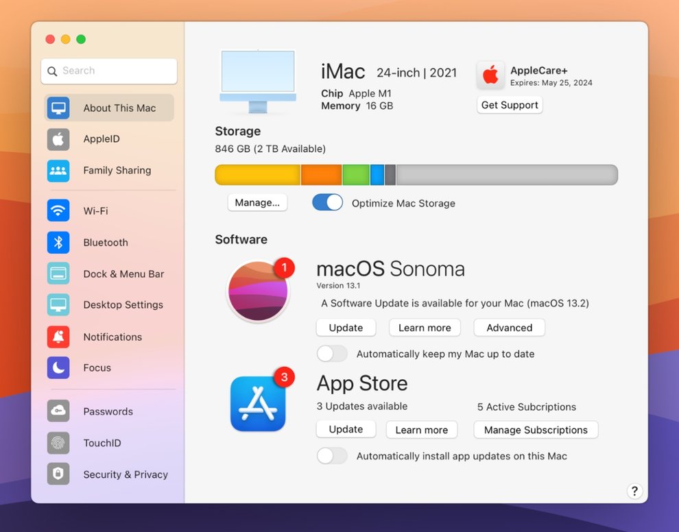
All software, AppleCare, storage, and subscription management can now be done from the About This Mac tab in the redesigned Settings app.
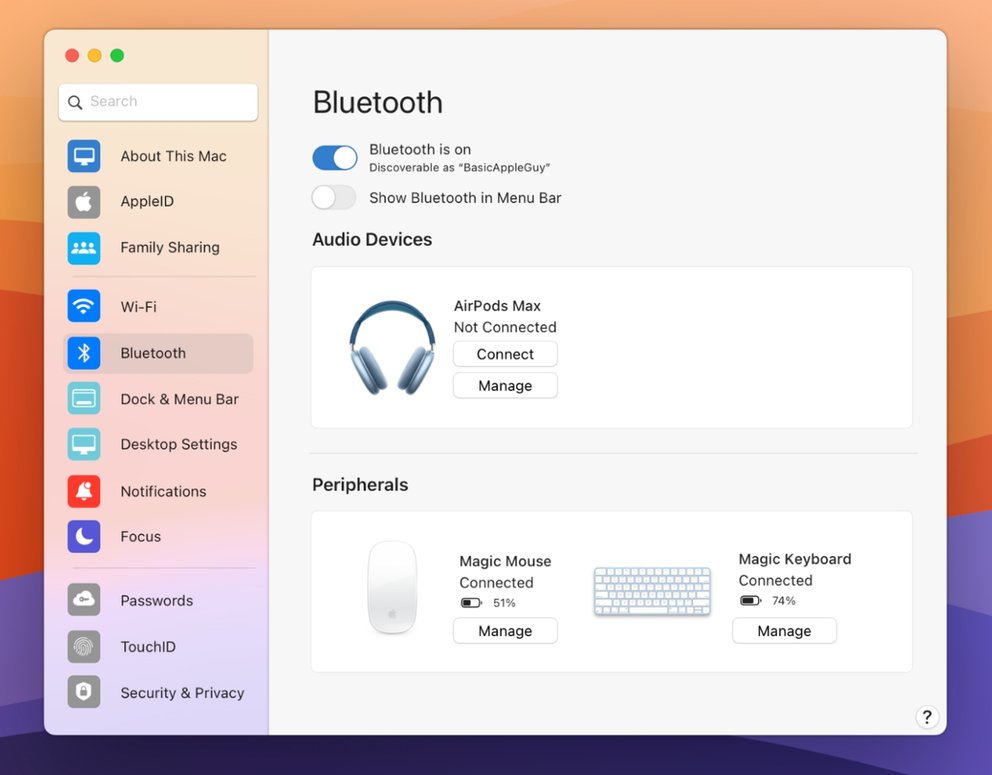
A modernized Bluetooth panel in Settings provides more controls and a cleaner UI for viewing and managing Bluetooth devices.
Our assessment: damn good work, the revision of the system settings is long overdue. The concept shown here pleases, on the one hand it is refreshingly new, on the other hand it should not directly overwhelm old macOS hands. A step in the right direction that Apple now has to be willing to take. Please fix and integrate into macOS 13.


Comments
Post a Comment